If you want an attention grabbing Instagram feed, try implementing any of these themes on your profile…
With brands valuing their social media profiles as highly as their website, and the rise of mega and micro influencers, it’s becoming more and more of a challenge to stand out from the crowd on Instagram.
It’s important to remember that whenever a user lands on your profile, their initial impression will be the decider in whether they scroll down or click on your individual posts.
Often, planning an Instagram theme is overlooked when building and maintaining a successful account. However, it plays a huge part in helping you grow your following and be successful on Instagram.
Now you’re probably wondering what the secrets are to creating an amazing Instagram feed? Well at Hopper HQ, we work with 10,000+ brands helping them plan and schedule their Instagram feeds, so along the way we’ve gained a heap of expertise on the topic…
Feel like you need to examine your whole strategy before diving into Instagram themes? Take a look at our step-by-step guide:
💡 How To Create A Winning Instagram Marketing Strategy 💡
Instagram Theme #1: Consistent Colour Palette
If you look at many popular accounts, you will notice a similar colour theme across all their content. The colour scheme may gradually change overtime, but the key point here is consistency. A consistent colour palette will automatically present your feed in a cohesive way, and enhance the overall aesthetic of your profile.
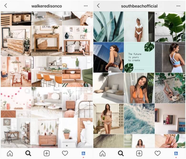
See the difference between the two Instagram feeds below — the one on the right is cleaner and more satisfying on the eye, while the one on the left looks messier and inconsistent in comparison:

There are many ways to execute an Instagram colour palette theme, and it doesn’t have to be as disciplined and uniform as Coconut Lane’s above.
You can post content which always contains an element of the same colour, or photos with predominant colours that complement one another:

This kind of Instagram theme allows you more freedom, as you can use more variety of content and even gradually change the colour palette if you want to.
However you decide to colour co-ordinate your feed, you can be sure that this Instagram theme will help your profile stand out from the crowd and your following will increase as a result!
Instagram Theme #2: Grid Tile Effect
A strategy that a handful of brands and influencers use is creating a larger image or design on their Instagram feed out of their individual posts.
This can be highly impactful when you land on a profile, and definitely encourages users to scroll and explore the content.
The important thing to remember with this Instagram theme, is that the individual posts are still relevant on their own. This way they still make sense in your followers’ feeds if they haven’t yet clicked on your profile.
A great example of this kind of Instagram feed is music festival Kala…

This Instagram theme adds another layer of creativity to your feed, and the possibilities for unique and impressive designs are endless.
Remember, in order to maintain the grid tile pattern, you will always have to post in groups of 3, otherwise the whole design will shift out of place.
A grid tile pattern Instagram theme therefore requires a lot of planning and discipline, so is not for the faint hearted! However it will definitely help you stand out from the crowd.
Visually plan your social content. Instagram, TikTok, Twitter, Facebook, LinkedIn + Pinterest
Instagram Theme #3: White Borders
Another way to create a stand out feed is by placing your photos and videos in white borders or frames to create a pattern.
This became a common trend back when Instagram only supported square posts, as a hack to not have to crop your portrait and landscape posts! Now it is simply a thematic decision to make your Instagram feed look more like a photo album or brochure.
Again there are a number of ways to implement white borders, whether it’s small squares, portrait, landscape, or a mixture…

Instagram Theme #4: Black & White
Consistently posting in monochrome is another way to maintain a cohesive Instagram theme. This is great for photographers and creatives to showcase their work and create a moody theme.

Instagram Theme #5: Flat Lay
Flat lay photography is huge on Instagram, especially in the restaurant world.
Instagram themes don’t just have to be about colours or patterns, but can also be created by using a consistent style of photography.
A flat lay theme is a great option for brands that can photograph their products from above, whether it’s tech, fashion or food. These feeds look engaging, and definitely keep new users scrolling for longer:

Instagram Theme #6: Horizontal Lines
Another option is to draw the eye by creating a pattern with horizontal lines across your Instagram feed grid.
We do this on our Instagram account at @hopper_hq, creating rows of different colours while the vertical lines are the same type of post i.e our Spotlight series.
Similar to the grid tile effect, this theme requires you to always post in threes and so requires prior planning and scheduling. But the result is very striking so the extra effort definitely pays off!

Instagram Theme #7: Vertical Lines
Vertical lines have a similar effect on your Instagram feed. Use to break up different types of content or colours.
This Instagram theme also draws the eye downwards, which naturally encourages scrolling!

Instagram Theme #8: Checkerboard
Similarly, a checkerboard pattern can be made by alternating different types of content! This is great if you publish a lot of text posts, as you can separate the quotes from photographs.
It makes a very striking pattern on your feed, and helps draw attention to certain posts.
You can make use of an Instagram grid planner to perfect this type of theme!

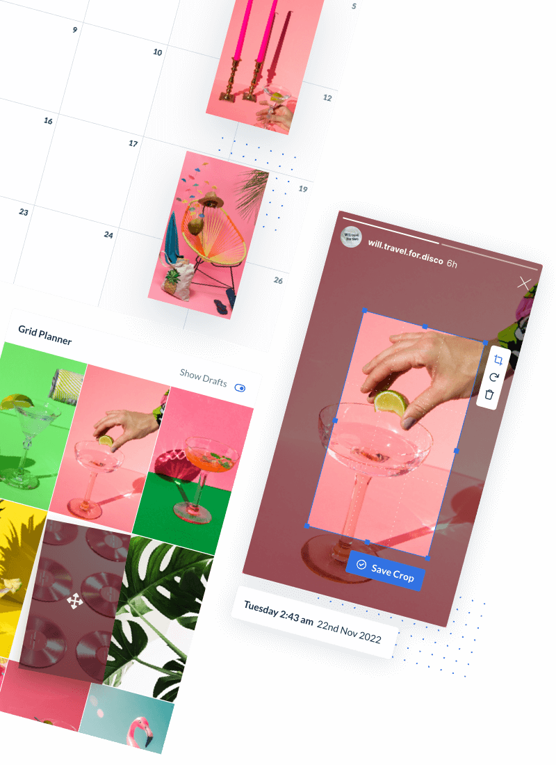
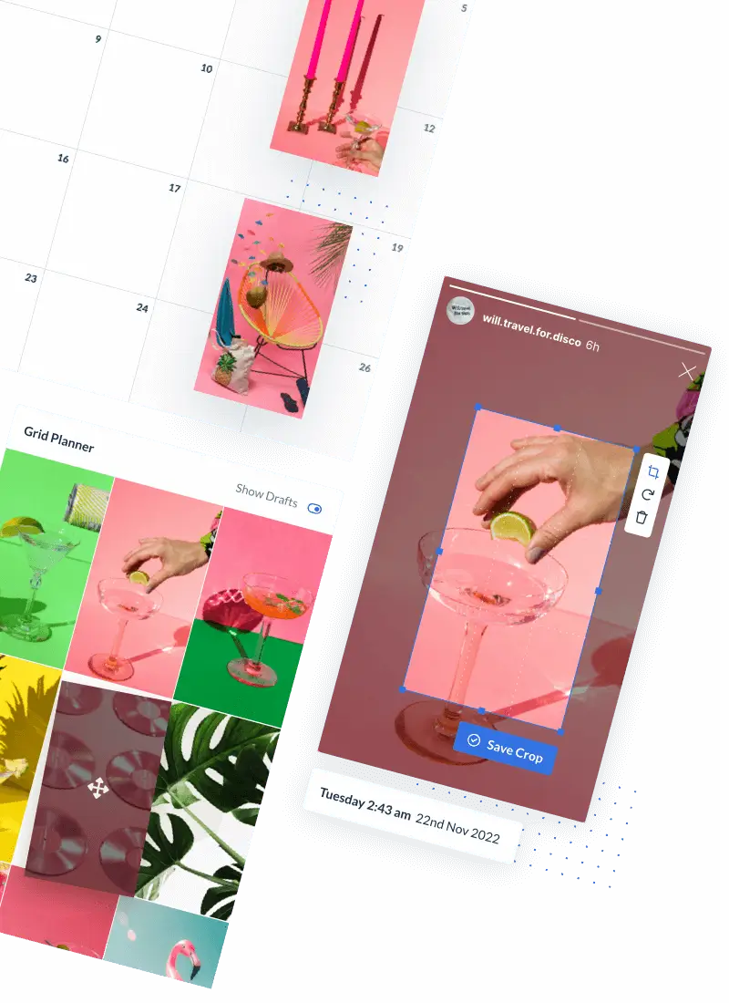
Plan Your Instagram Theme With A Feed Grid Planner
When it comes to planning your Instagram feed and maintaining a consistent aesthetic, it’s important to know what your feed will look like before you publish your content, so you can ensure:
- Colour palette cohesion
- Even variety of content
- Posts do not clash
Using a grid planner when creating your Instagram theme also carries the advantage of being able to quickly switch the order of your content around in your feed and figure out what looks best.
This is particularly valuable if you are using different content types or colours to create horizontal, vertical or checkerboard patterns.
There were reports of Instagram beta testing their own version of a grid planner, although currently the feature is unconfirmed with Instagram.
However you can use a tool like Hopper HQ Instagram Scheduler that has a grid planner built-in, allowing you to plan what your Instagram feed will look like before you publish your content.
Schedule Your Instagram Feed
Of course one of the most important aspects to planning an Instagram theme is just that, planning!
In order to ensure you have the best looking profile possible, you need to be organised and know exactly what you want your Instagram feed to look like in order to know what content to shoot and how often you’re posting.
Areas of your Instagram marketing strategy will need to be revisited in accordance with your new theme, which is why it’s important to be as organised as possible.
In order to create an attention grabbing Instagram theme, you can no longer post spontaneously or in a rush. It’s therefore necessary to plan and schedule your Instagram posts in advance.
This carries many advantages including better content management, saving heaps of time, and streamlining your workflow. When trying to maintain an Instagram theme, you need a lot of content. Most of the time this will all be managed on desktop, and so being able to manage that in one place and post to Instagram without touching your phone is a life saver.

To find out how you can start scheduling your posts, check out our how-to guide on scheduling.
> Video, gallery & image posts
> Calendar, feed & grid preview
> Instagram, Facebook & Twitter


