We’re all after the perfect Instagram layout — here’s how to achieve it using an Instagram grid planner…
Why plan your Instagram feed?
In recent years Instagram has become a primary marketing platform for businesses, to the point where Instagram profiles are as valuable as company websites.
Despite people finding new Instagram accounts via Reels or single posts — from hashtags, locations and tagging — once they land on a profile, it’s the 9 grid Instagram layout that makes a lasting impression that gets you scrolling for more.
Brands, influencers, and creatives need to therefore make sure their Instagram posts look good when placed all together on their Instagram feed using an Instagram grid planner!
A consistent Instagram feed theme can really affect the overall impact of a profile, which is important to bear in mind when planning your Instagram marketing strategy.
Visually plan your social content. Instagram, TikTok, Twitter, Facebook, LinkedIn + Pinterest
How to plan out your Instagram feed with an Instagram layout planner
Here are some tips for creating a great Instagram layout and using the Hopper HQ Instagram grid planner.
Step 1: Find a theme for your Instagram feed aesthetic
There are many kinds of Instagram themes, but the one thing they all have in common is consistency.
This requires discipline and planning when it comes to content creation and curation, which is why it’s no easy feat!
While you look through the following suggestions, use our no-account-needed Instagram grid planner to map out your perfect feed.
Themes will vary depending on the industry and the type of content you’re publishing, but here are a few ideas to get the ball rolling:
1. Pick a color palette
There’s something incredibly satisfying about an Instagram account with a clear color palette.
It looks clean, stylish and well-curated. Using a color palette theme will require an Instagram grid planner to ensure a seamless transition from post to post. If you don’t have a naturally artistic eye, you can use a color palette generator in order to browse color schemes and see the kinds of colors that complement each other in photographs.
You can either stick to one color throughout or use a color palette to transition through various colors as you scroll! There are many possibilities, and once you decide on a color scheme you can create content accordingly.


2. Use white borders or frames
Another way to create a stand-out Instagram layout is by placing your photos and videos in white borders or frames to create a pattern.
This became a common trend back when Instagram only supported square posts, as a hack to not have to crop your portrait and landscape posts! Now it is simply a thematic decision to make your Instagram feed look more like a photo album or brochure.
Again there are a number of ways to implement white borders, whether it’s small squares, portraits, landscapes, or a mixture!


Visually plan your posts. Drag & drop everywhere in seconds ✨
3. Create an Instagram grid pattern
Many brands use a variety of content and photography types on Instagram. Whether it’s flat-lay product shots, typography quotes, or UGC — you can incorporate the different forms of content into your Instagram layout!
This could be in the form of a checkerboard or horizontal/vertical lines and gives you the chance to be creative without restricting your content choices too much.
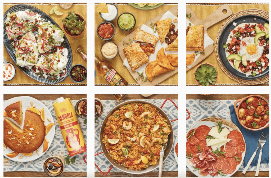
Another way of utilising the grid to make your profile stand out is to make all 6 or 9 squares into 1 bigger image when combined.
If you choose to do this make sure the individual squares work as individual posts, as that is how they will appear on your followers’ feeds!
Here’s an example:
Aldi UK is the master of this; their Instagram profile looks like a never-ending table but each post focuses on a specific food item.

Remember: if you choose to create an Instagram theme like this, you will always need to post in threes, so that the layout stays intact. This is when an Instagram grid planner is necessary, as you can line up your posts into the grid theme and make sure the pattern matches up!

Visually plan your posts. Drag and drop everywhere.
Step 2: Use an Instagram grid planner to create your layout
At Hopper HQ, we built our own Instagram grid planner to help you perfect your Instagram layout at the same time as scheduling your content for the coming weeks!


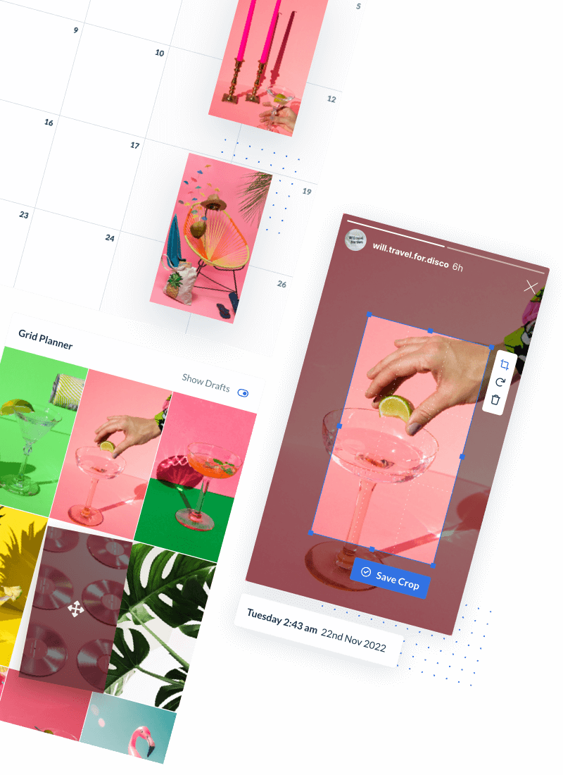
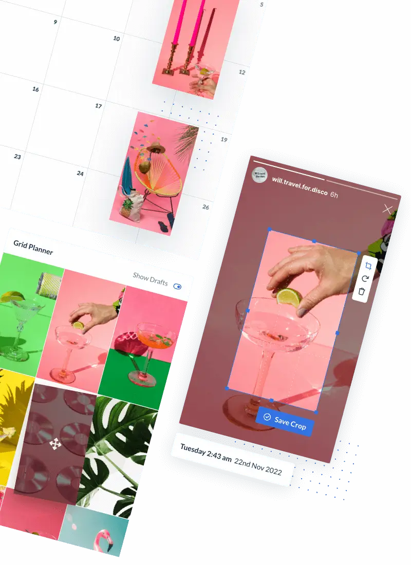
The Instagram grid planner on Hopper HQ allows you to see what your Instagram profile layout will look like once all your scheduled posts have been published.
This is incredibly useful if you’re trying to create one of the Instagram layouts discussed above.
You can drag and drop your posts around to test the best combinations and layouts before they are sent to your Instagram account.
The Hopper HQ grid planner makes the process of creating a beautiful Instagram feed much quicker and easier. Regardless of your layout, colour palette, or pattern, you can use the Instagram grid planner to ensure no posts clash and ruin the pattern you’ve spent so long creating.
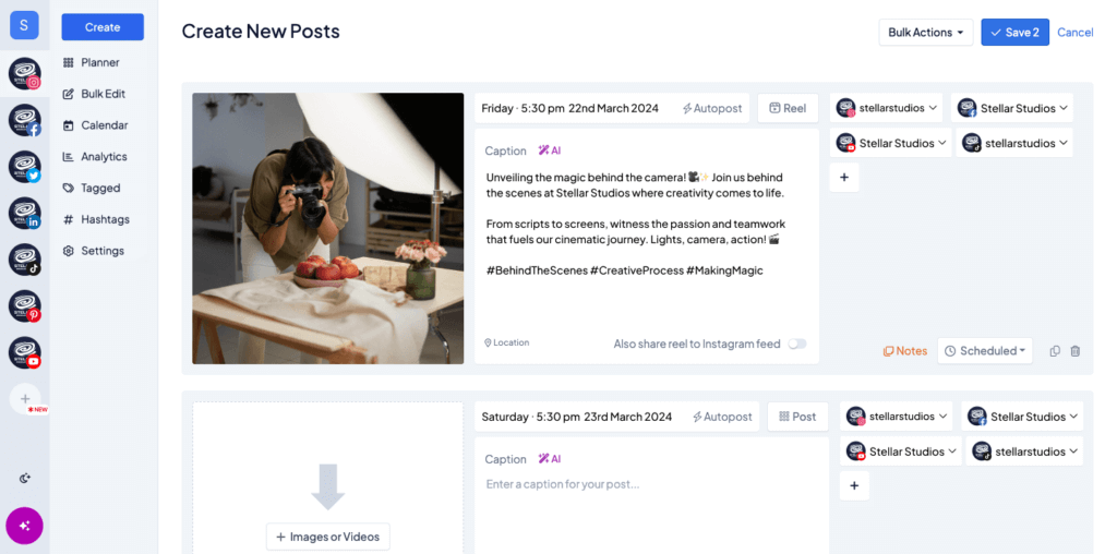
With Hopper HQ, you can bulk upload up to 50 photos and videos in one go, scheduling them as far in advance as you see fit while ensuring your grid feed remains consistent and striking.
You can choose to preview your Instagram feed with Reels or preview image posts separately to get your feed looking exactly how you want it.
We believe this Instagram grid planner is a game changer for social media marketers! Say goodbye to the test Instagram accounts you were using to check for your Instagram feed cohesion, and visually manage all your content in one place.
Find the best time to post, track your follower growth, and understand what content works best with post and account analytics.
Will an Instagram grid planner come to the Instagram app itself?
Back in 2018, Hopper HQ received insider reports of an internal Instagram grid planner feature in beta mode to certain users. We were able to get our hands on exclusive screenshots of how it looked:


Sadly, this feature only seemed to reach testing mode on Instagram, as it was never officially released in an update!
This does however show that Instagram is clearly thinking of ways to help brands, influencers, and individuals plan their feed aesthetic and ensure their posts match the content already on their profile.
We’re certainly keeping our eyes peeled for a new Instagram grid planner feature release. 👀
Curate the perfect Instagram feed with Hopper HQ
The Hopper HQ Instagram grid planner lets you easily drag and drop your upcoming posts to curate the perfect Instagram feed. You can choose to review your Instagram feed with or without Reels to keep that Instagram aesthetic on point.
✨ Try out the Hopper HQ Instagram grid planner for yourself and enjoy many more features by signing up for a free trial today! ✨
FAQs
How to use Instagram layout?
Drag and drop your upcoming posts to curate the perfect Instagram feed in the Hopper HQ Instagram grid planner. You can rearrange your scheduled images to get the right Instagram aesthetic and click save when you’re done.
How do I visually plan my Instagram feed?
Hopper HQ’s visual Instagram Grid planner lets you easily preview and rearrange your feed before posting. You can see how your Instagram profile is going to look before your posts are published and maintain a beautiful Instagram aesthetic. Just drag and drop your upcoming posts to rearrange them the way you want.
Visually plan all your social channels. Instagram, TikTok, Twitter, Facebook + LinkedIn.


